STORY
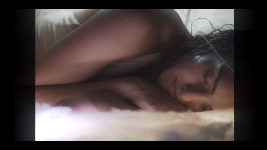
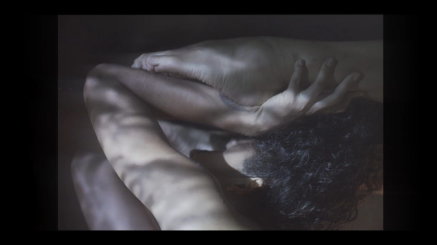
The story represents a personal real-life account of a friend’s journey, told using the metaphor of a silkworm spinning a cocoon. The tragic story of the silkworm is that in order to extract the silk to create fabrics, the cocoon must be destroyed, preventing the silkworm from ever becoming a moth. We wanted the meaning of the video to be open to interpretation, so we abstracted the story by mixing it with a poem that was written by another member of the band. For the set design, it was important to include warm, womb-like colors and natural colors in order to represent the human body– birth and rebirth. I kept the color grade very simple and mostly flat for this, for an understated look.

CINEMATOGRAPHY / REFERENCES
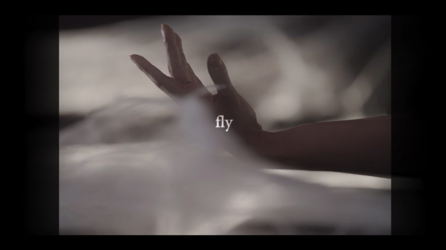
For this video, we originally conceptualized it as a series of intimate, macro shots that showed the transformation of a silkworm into a cocoon. When the artist showed us a black and white archival film from a silk moth documentary, I wanted to make sure that any new footage that we shot would blend well with the archival, so I decided to approach the project with a “retro” look in mind. I wanted the aesthetic of the new footage to have that same, observational, 1950’s or 1980’s educational aesthetic, with long focal length’ed macro shots and steady static shots.

So we shot on sticks with a digital cinema camera– sony fs700 instead of a small DSLR. My producer wanted us to use a DSLR for budget and also because he believed that we’d want to have more mobility for the shoot, but handheld shots and the low dynamic range of the Sony A7sII would have completely contradicted the look I was going for.
Handheld camera movement became common in indie films and videos at the advent of the first prosumer digital video cameras, starting with late generation handheld camcorders that shot in progressive frame rates instead of interlaced, and spiking in popularity after the 5D Mark ii hit the market– when cinematographer, Vincent Laforet’s famous first demo of the camera went viral. Back when professional films were first being shot on these small cameras, the camera shake was regarded as an amateur mistake, but eventually, like all art forms, the new generation of young “videographers” turned it into the familiar style of low budget music video shooting we see often today.
It’s important to note that the type of camera shake you get in small DSLR’s is COMPLETELY different from the quality of camera shake you get with larger, heavier cameras. Often times, the smaller cameras end up with “jello” warping in the image due to a shaking sensor. The bigger cameras are able to maintain the solidity of the video image even with quick camera jerks and lots of movement. Also, the sheer weight of the larger camera leads to a smoother, more solid feeling in the camera shake, whereas a small camera feels more like it’s shaking like a leaf unless it has more weight added to it or additional support.
All this is to say that the handheld aesthetic is relatively new and stylistically represents contemporary low budget music videos. Creating a retro look IS NOT just about throwing on some film burn filters and film grain. Everything from the lighting to the camera settings and camera movement all tie into the filmic look.
PRACTICAL EFFECTS
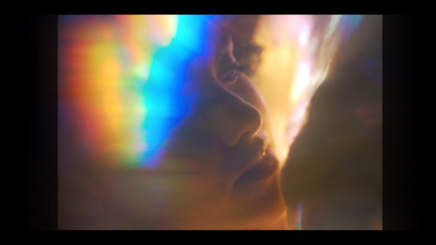
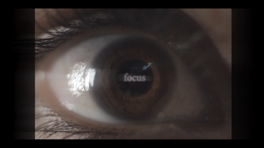
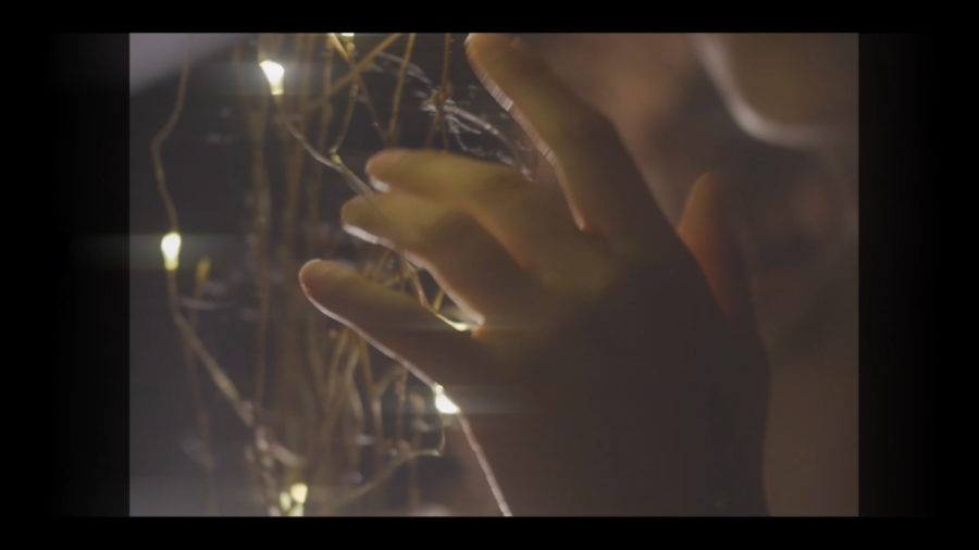
We got extension tubes to increase the macro capability of the lenses– it was always important for the piece to feel extremely intimate. I told my producer that I wanted to be able to count each eye lash surrounding the talent’s eyes, and I’m very pleased that we were able to achieve that. I bought a bunch of suncatcher crystals and cheap toy kaleidoscopes from amazon to hold over the lenses for the abstract effects. Nearly all the lens flares were done practically– a technique that I picked up from Director/DP Tom Swindell while helping him out on his Bunji Garlin “Big Bad Soca” music video a while back.

We also used some large acrylic cubes and prisms. Out of all the filters, we found that it was the kaleidoscope toy and the triangular prism that made the coolest effects.
EPIC DRONE SHOT / COCOON EDITING
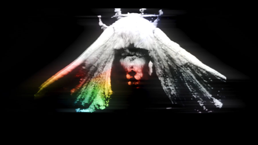
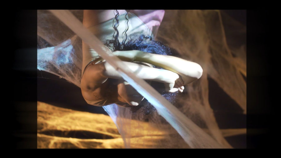
Special thanks to my dear friend Jeremy Hansen of Devotive, a video production house based in Manhattan, for drone operating on the day of the shoot and allowing us to get this epic shot. We spent about 3 hours setting up and shooting this final image which lasts only a few seconds. That said, I think it turned out great– very similar to what my original vision was!
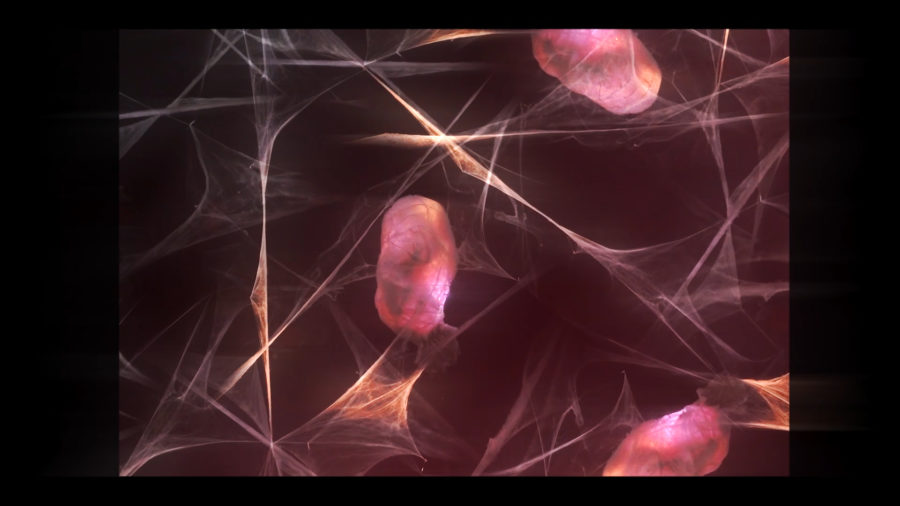
When I’m not working with a VFX editor or team, I do all of my own effects in Adobe Premiere Pro (yes, eventually I’ll learn a bit of After Effects myself, but til then, I’m happy to invent some cosmic work-arounds in Premiere to get the right effects).
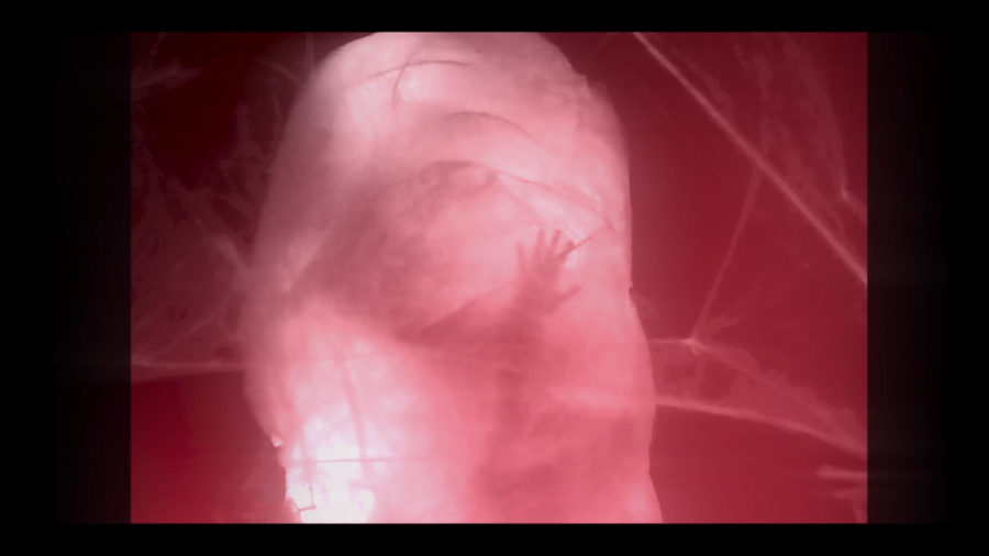
In order to create an image that contained multiple cocoons, I first extracted a small clip from the longer drone shot that looked the steadiest. I applied good ole’ “warp stabilizer” filter to make the shot extra steady, and turned that into a nest. I then created a sequence with the largest dimensions possible in Premiere. I took my warp-stabilized cocoon nest and copied it across the frame, turning and flipping each cocoon so that its webbings blended together in an aesthetically pleasing way. I also slightly scrubbed each video clip so that the timing and movement of every cocoon was slightly different. It’s subtle, but that detail made a HUGE difference. I made a test comp of this previously, and discovered that if the timing of all the clips was exactly the same, then the movement looked far too mechanical.

I used Premiere’s “opacity” function to add a bunch of inverted garbage mattes to the edges of every cocoon clip. That way, the clips blended together with no hard edges of the frame remaining. In opacity, I chose a filter (either lighten or overlay) that would allow the webs to intertwine and give the intersections of each web an ethereal glow.
Finally, I nested that large sequence returned to the main timeline, and multiplied that across the 1080p frame. I turned and flipped these nests as well, and repeated the process of blending out the edges with mattes until the whole frame had a cohesive look. I added a Lumetri Color effect and set it to warm up the color of the cocoons. I then garbage matted that into a wavy shape over the whole image to create a color play between slight-warm and slightly-cooler toned cocoons. Then I placed a slight vignette over the 1080p frame as the final “varnish” to unify the collage.
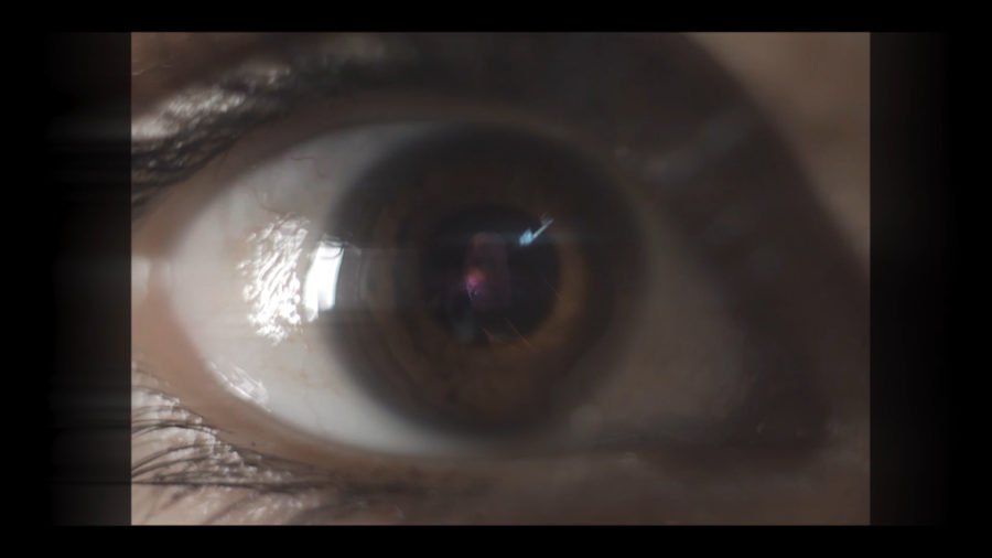
Overall, this process was very time consuming and tedious, but the team and I were really pleased with the results. Composing these cocoons was very much like composing a painting.
COLOR GRADING / POST PRODUCTION
I’ve crafted my own post-production process to create the retro aesthetic, not using any pre-made filters or LUT’s. It’s important to me to do all my effects and grading from scratch so that the final video is as original as possible.

I cropped the video down to match the size of the archival silk moth footage, and even though the top and bottom of the frame were cut down as well, I really quite liked how that close cropping added to the intimate feeling of the edit. So I kept it.
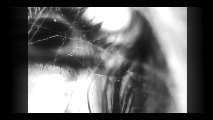
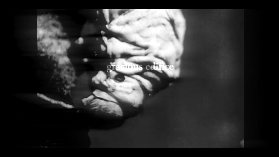
I won’t give all my secrets away regarding post-production for the retro look, but one important element is layering. Once we achieve picture-lock, I export a ProRes 444 version of the entire film and create a new timeline where I make several layers of the exported full video. From there, I add blur effects, vignetting, and other effects while adjusting opacity as needed to create the overall look. This creates cohesion while still letting you emphasize certain moments by simply adjusting the opacity of each layer. A lot of editors just place a crop layer over the entire final image to achieve the smaller aspect ratio, (or you can do it the correct way by setting up your timeline at the desired aspect ratio) but to me, this looks fake and you lose a great opportunity for additional creativity. It’s much more natural when the glow of the image affects the edge of the crop– where the light and darkness of each clip pulls and pushes at the edges, blurring the cropped edge in a subtle way so that the final image looks much less rigid and digitized.
TEXT / GRAPHICS
For this video, I played with the idea of cropped edges by letting the text elements and certain clips break the boundary of the crop. The idea of the cocoon and an underlying element of the story was that the character is being trapped in a situation she doesn’t want to be in, so one way that I represented “breaking boundaries” was by letting the text appear over the entire 1080 frame.
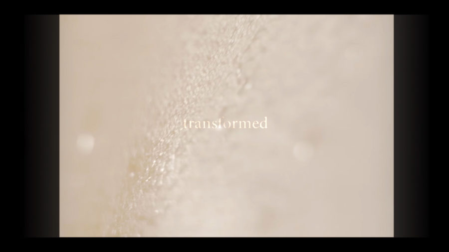
The text was also meant to represent thoughts– racing thoughts that the character might be having as she continued on her journey. I also wanted the text to have a jittery feeling, like a moth trying to fly with a broken wing, or an insect exploring a new environment.
It wasn’t important for anyone to be able to read all of the text, since it’s primarily supposed to convey a feeling. Upon repeated viewings though, you’d be able to see that there are actually 3 different perspectives to the same story being told, each separated by different “regions” in the frame. Eventually, I’d like to upload a text-only version of the video so that anyone interested in the narrative can read it easier.
VIDEO / CREDITS
Without further ado, here is the video.
Commissioned by keyboardist @flymyspcshp / Jason Lindner.
Directed by @leemilby / Lee Milby
Produced by @timbrefarm / Sharan Kukreja
Asst. Director @devalmystery / Deval Mistry
Art and Sets by @daturablacknyc (Cassaundra Franklin) & Nikki Christmas
Drone Op @jeremycurthansen / Devotive
Key Grip Alexander Sepi
Contortionist @nikki_ortiz
Special thanks to @kskstudios for editing support and @francoisenvoranger for location
