There’s nothing like the classic look of film, and recently the “film look” has gained a lot of popularity in the music video and commercial video world.
Since shooting on real 32mm , 16mm, or super 8 film can be incredibly costly (the film costs $$$ plus you need a bigger crew and more equipment on set such as lighting to shoot film properly), I’ve developed special post production vfx that allow me to recreate a filmic look while using 4k digital video.
As a film and music video director, the vintage/retro/film like look is my favorite genre!
Nostalgic, Filmic Music Video Direction
“Oh, Love” for The Broadest Blue – this music video was shot with a Sony A7sii DSLR camera and a limited set of prime lenses. We stopped down on the exposure to allow for most of the shots to have crunchier, more soulful dark tones, and limited blowout in the whites that is so characteristic of this particular camera (and many other non-cinema cameras).
I did not shoot log for this. Instead, I used a lightly graded setting to create a naturalistic, slightly contrasted look. We shot in natural daylight, so over the course of our 1.5 day shooting schedule, I kept my settings mostly the same and focused on capturing the moodiness of light filtering through the space.
I’m a huge fan of using in-camera practical effects and lens filters, so on set I used a series of crystals and prisms to create surreal, abstract effects. The use of practicals is important to me, because the naturalistic movement of the prisms works in tandem with the post production effects I apply later to lend more realism to the final video. If you add too many VFX, things can start looking really fake and flat. With a good mix of practical abstractions plus post light leaks, you can blend things together into a cohesive, visual menagerie.
In post, I did a general color pass to ensure that there wasn’t any jarring optical color problems from one shot to the next, but really let my in-camera settings do most of the work. Very light grade on the raw footage overall.
Then comes the real work: my special post production filter process.
My filtering process is not complex, but requires a lot of attention to nuance. It’s super easy to overdo the effect, and the effect works best when it’s subtle.
First, I crop the image. When I’m doing these things, I’m not focused so much on copying a filmic look perfectly. My main focus is creating a look that evokes the feeling of a certain time period. So when I crop things, I tend not to go for an exact aspect ratio – it doesn’t need to be a perfect 3:4.
I duplicate the cropped video layer several times, then apply different opacity effects in Premiere such as “color burn” “additive color” “multiply” to taste, until I get the amount of contrast and highlight I’m going for, in this case a bit crunchy with the darks and a bit blown out with the lights.
Over top, I add a layer of film grain, set to “linear light” at about 33%.
I’ll layer multiple film grains atop one another to give the video extra character.
THEN I add blur.
I export the entire edited video up until this point, and layer the video on top of itself 2 or 3 times.
I set each layer to “overlay” or “screen” at a very low opacity, maybe 13%. Then add the “motion blur” effect horizontally. I do this to 2 layers, each with a different amount of blur, which gives the video a nostalgic glow.
I’ll then do a layer of gaussian blur so that the glow extends vertically just a bit.
1980’s Educational Documentary Style Music Video
“Silkworm Society” for NOW VS NOW – The aesthetic for this music video was based on 80’s educational videos. We used long lenses, I think it was mostly 80 – 100 mm’s for this one. I preferred long to match the macro shots in the archival footage, plus create some distance between the subject and viewer. I wanted the audience to feel like they were examining the subject from afar, like a nature documentary, as the contortionist featured in the video represented the human embodiment of a silkworm trying to form a cocoon.
From the beginning, the artist wanted to utilize educational imagery of silk worms and moths emerging from cocoons. I used the same cropping and glow effect as previous, though for the color grade itself, I kept things a lot flatter. We shot this one on a Sony FS700, borrowed from production studio KSK STUDIOS based here in NYC.

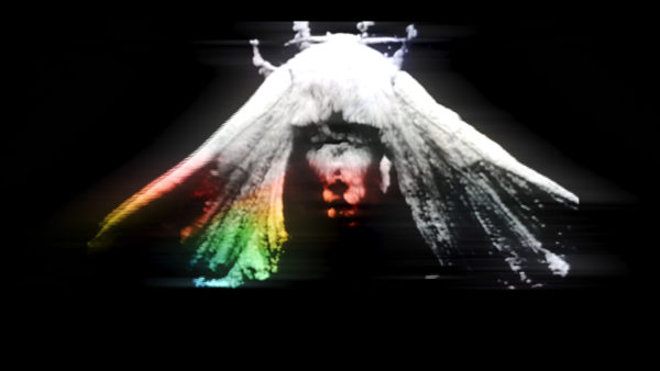
 I graded some of the footage in black and white to add a little more cohesion with the black and white archival clips. I matched the aspect ratio of the new video with the archival to make things blend more as well. When working with multiple file formats, you have to find a way to make things edit smoothly together.

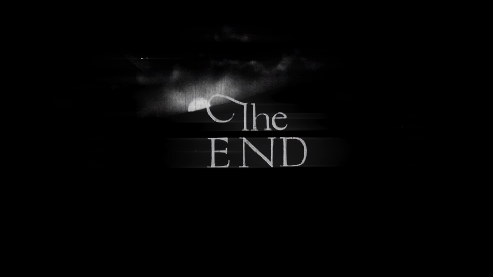
For the title card, I cut individual letters from archival black and white footage to create the words. If there had been more time in the production schedule, I would have loved to do this treatment for all words throughout the piece. 

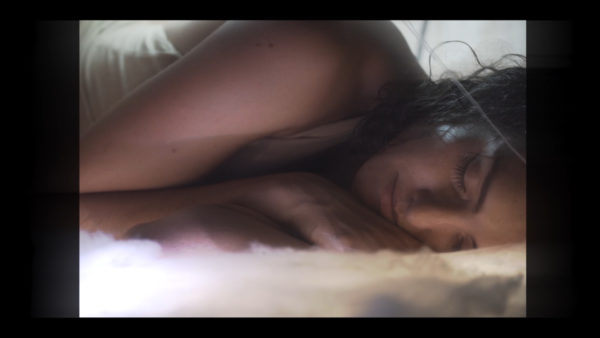
The motion blur / gaussian blur overlay effect adds a nice softness to all the tones in the image, especially the shadows. It helps give the video a delicate, filmic look.


One added benefit of using blurred overlays is that it smooths skin texture, adding a bonus beautifying effect to skin and making shadows less severe. If the above shot had higher contrast, it would be quite scary! But lower contrast and lightened shadows makes it eerie instead.


Low contrast with a very subtle blur creates a “distant” higher end look to the footage.
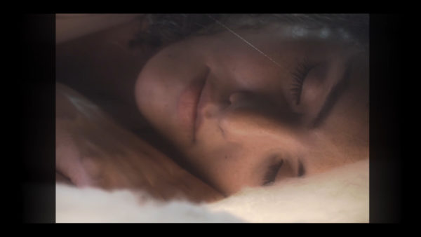

This shot shows more clearly how the blur overlays add glow and bleed to the image. This adds character and gives it a nostalgic feeling.

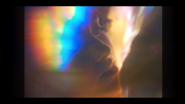
Just like with the other videos, I placed crystals in front of the lens to create abstract practical effects.


Including archival lettering can help sell a vintage or retro style music video.
Directing a Retro Style Music Video
“Exist” for Cate Hamilton – Was going for a 50’s – 70’s vibe for this one. We shot on an ARRI Alexa Mini with a special blooming filter to soften all the shots.
I lost my reference folder, but here are some stills interspersed with 70’s photos and portraits, the same kind that I used to create the color story for this music video:
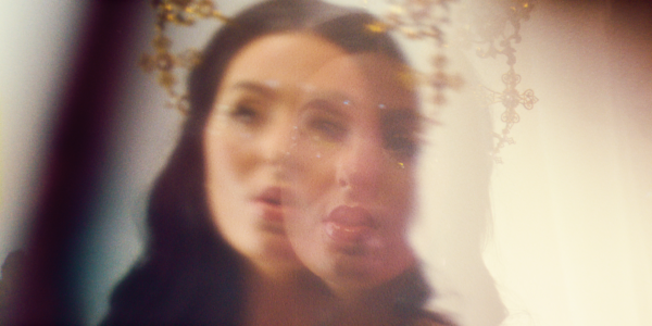
I used crystals in front of the lens to duplicate the image of the artist throughout the piece. The crystal effects were used as wipes and transitions, that helped pull the piece together after lens flares were added in post.
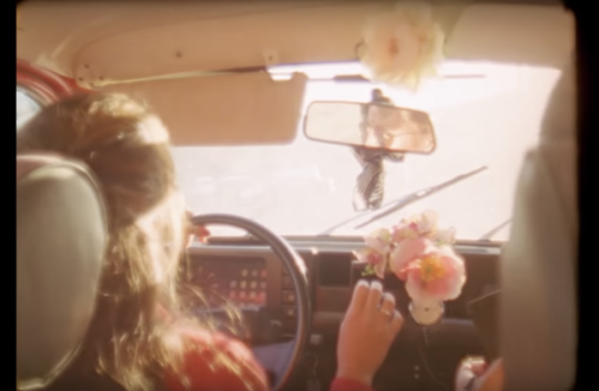
Here, you can see how I used muted warm tones with cool leaning shadows to create a strong “nostalgic” aura.
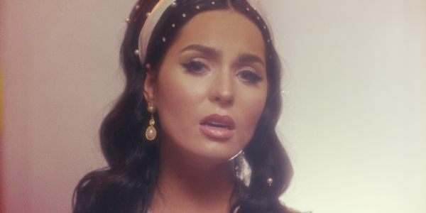
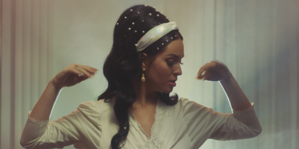
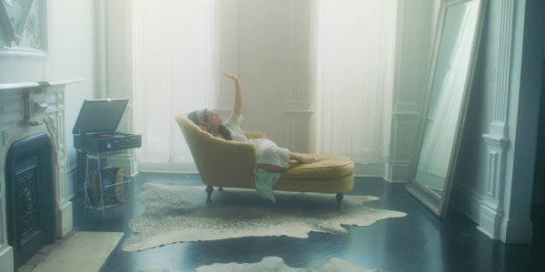
A big factor of 70’s film photos was an overall tinted look – usually leaning either to a warm, bright yellow or a cool blue.
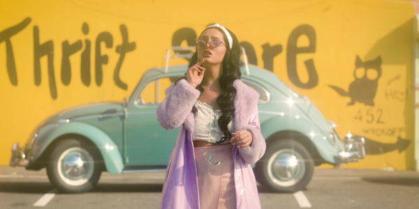

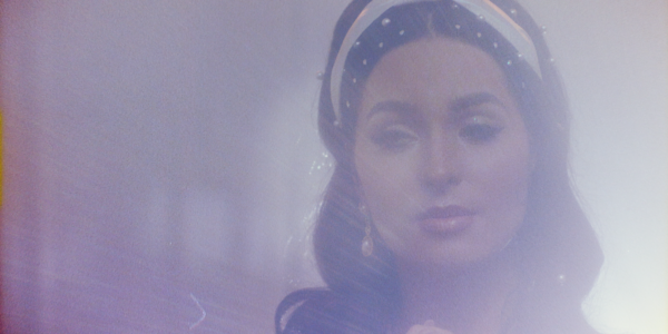
Film overlays and grain texture, including dust and scratches sell the look.
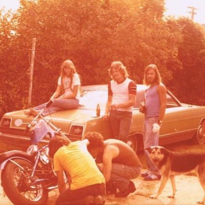
Here you can see I emulated the bright orange leaked look, where a saturated orange color replaces shadows. Film overlay added.
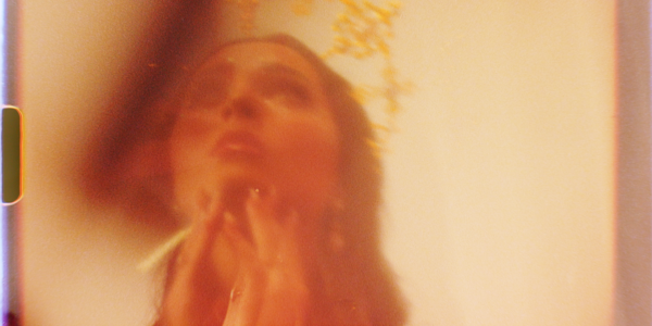
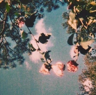
Film photos often have crunchy, very dark, rich blacks in the shadows with unusual saturation points. Again, these reference photos weren’t the exact ones I used to grade off of, but you can see how the unusual use of saturation and color tinting that captures a 70’s aesthetic.
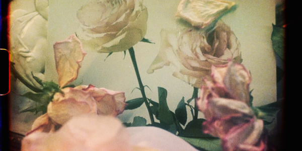
The most important aspect to my approach with creating nostalgic, retro, vintage aesthetics for music videos (or films, commercials, anything for that matter) is specificity and concept.
The music videos I chose to use this look for had concepts related to time. The lyrics of “Exist” are “Time doesn’t exist and yet we’re living.” The track “Oh, Love” was based on an experience the artist had over time healing from a bad romance. And “Silkworm Society” was dedicated to a dear friend of the artist who had sadly passed away. Nostalgia is such a powerful feeling and difficult to accurately evoke – instead my goal with these projects is to evoke a different feeling altogether – something called “sehnsucht.” This word means “longing and nostalgia for a far-off home one has never visited,” or in this case, longing for a time that never really existed in the first place. Since I’m working with video and not film, my goal is not to simply duplicate the look of film. I’m not looking to copy, but instead to use elements from different time periods such as color and film grain, in order to make something new entirely.
Looking to create a video with this type of aesthetic? Contact me at lee.milby@gmail.com – Lee Milby, Director
